BRANDINGThe Milk & Honey Project
A business that supports women in dancing with their fire. A place where women can live their most authentic lives.
This business is devoted to empowering women by freeing them from limiting beliefs that inhibit their journey toward embody their full potential.
From day one, the vision was crystal clear— a business charged with vibrant, unapologetic energy, itching to come to life. What immediately came to mind was the imagery of an African goddess: a symbol of richness, intrigue, and comfort tailored to the target audience.
The client went all-in, showing real confidence in making a strong statement—
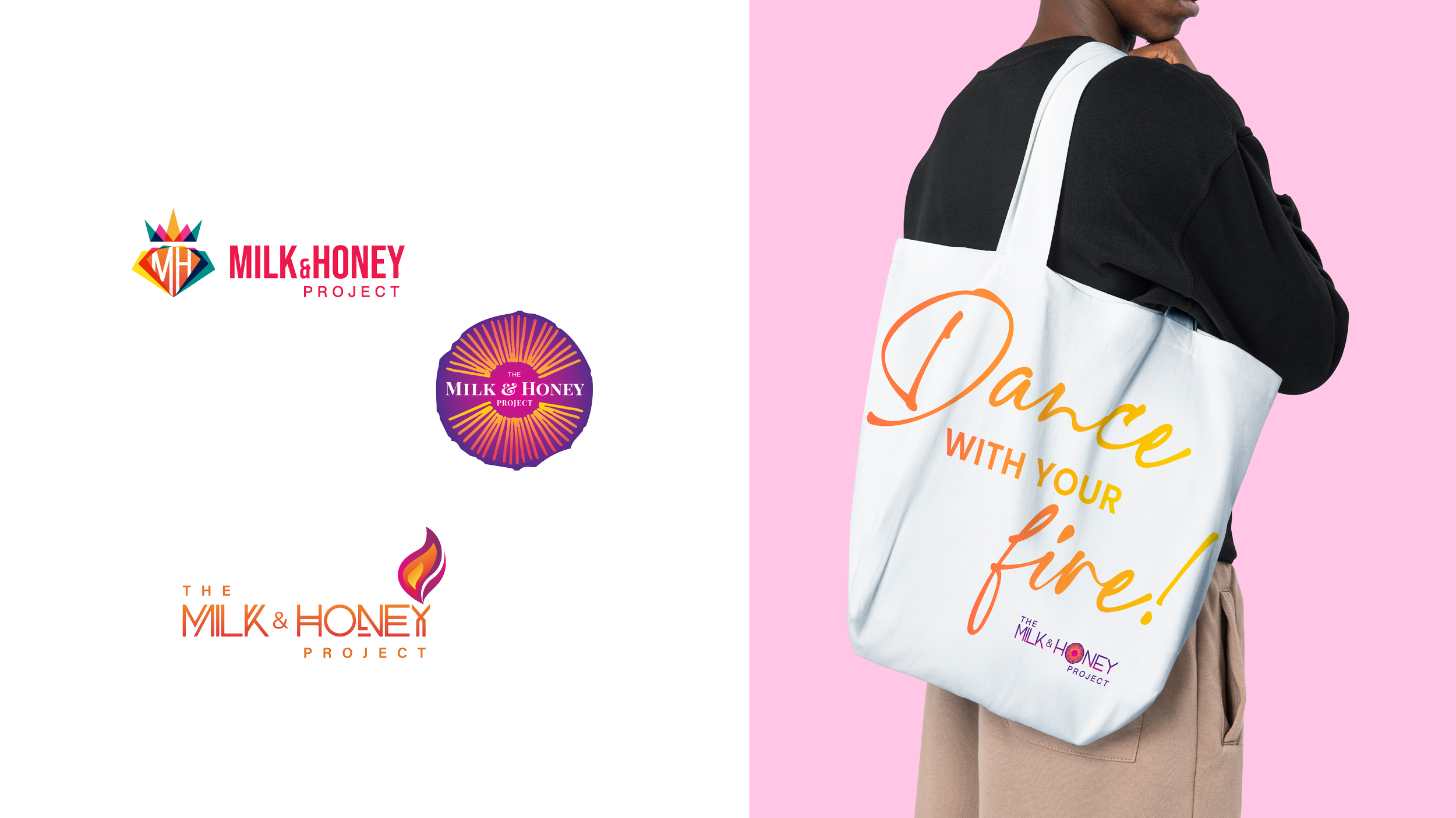
a bold move towards opulence and extravagance. We discussed ideas like sunsets, the nature element of fire, and the glamorous charm of gems like emeralds and sapphires.
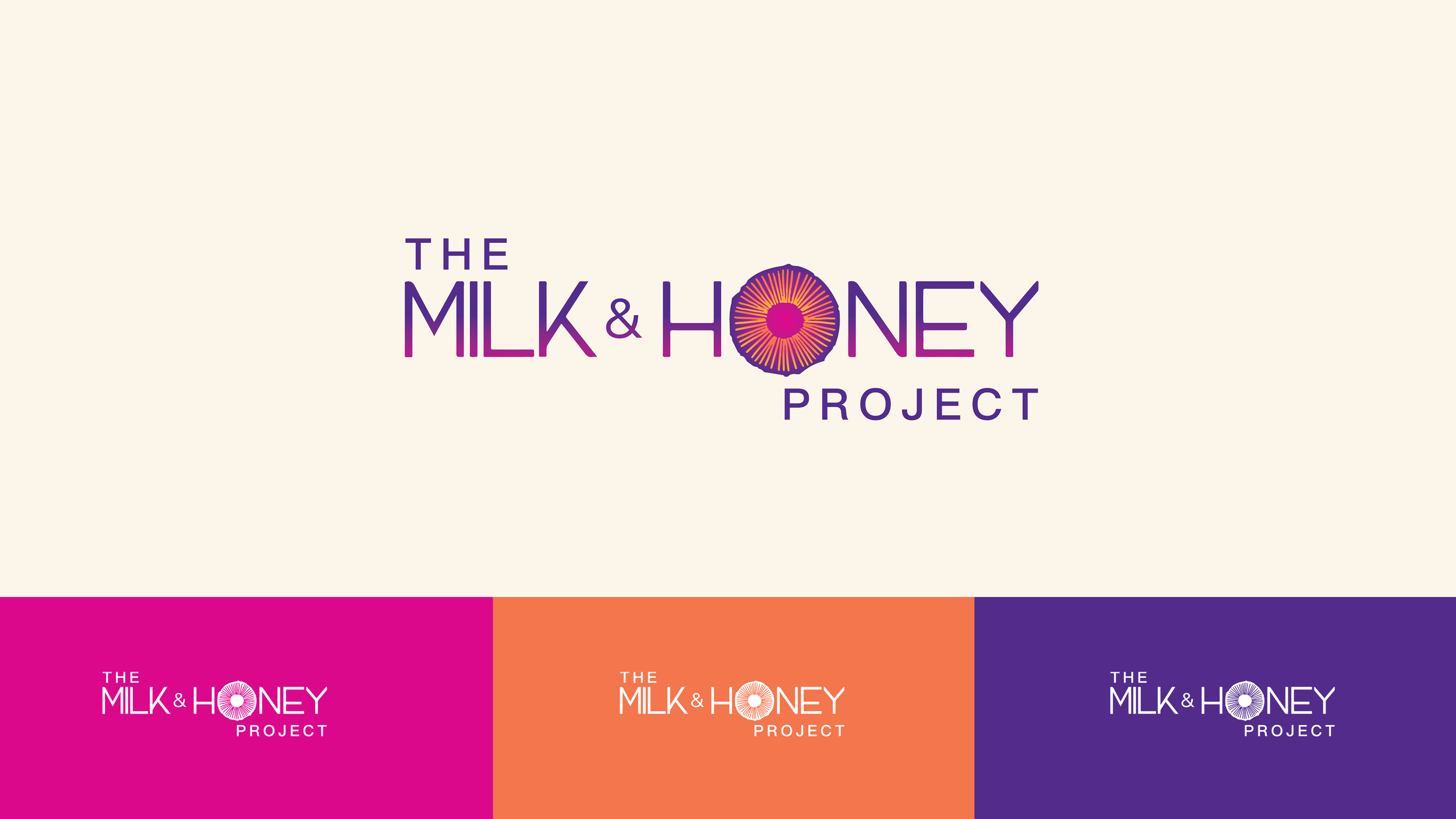
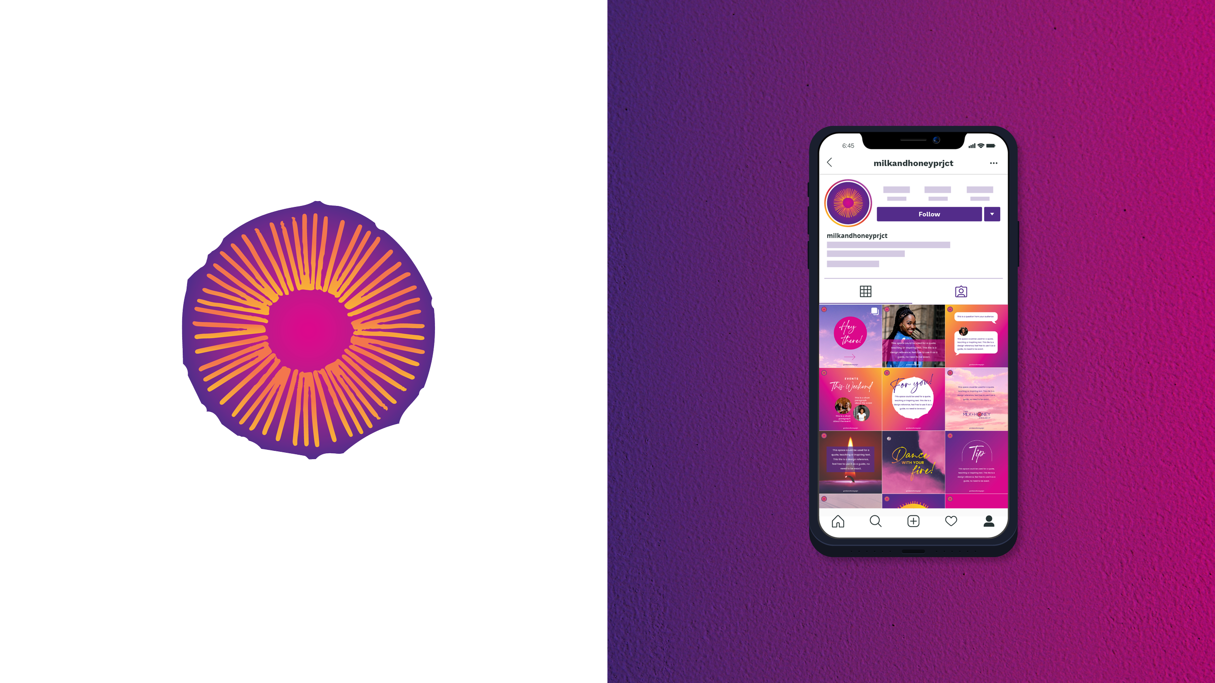
An image that resonates with tribal heritage and the strength of a community of women. The circular shape speaks of an ongoing healing journey, a testament not to weakness but to inner strength and courage.
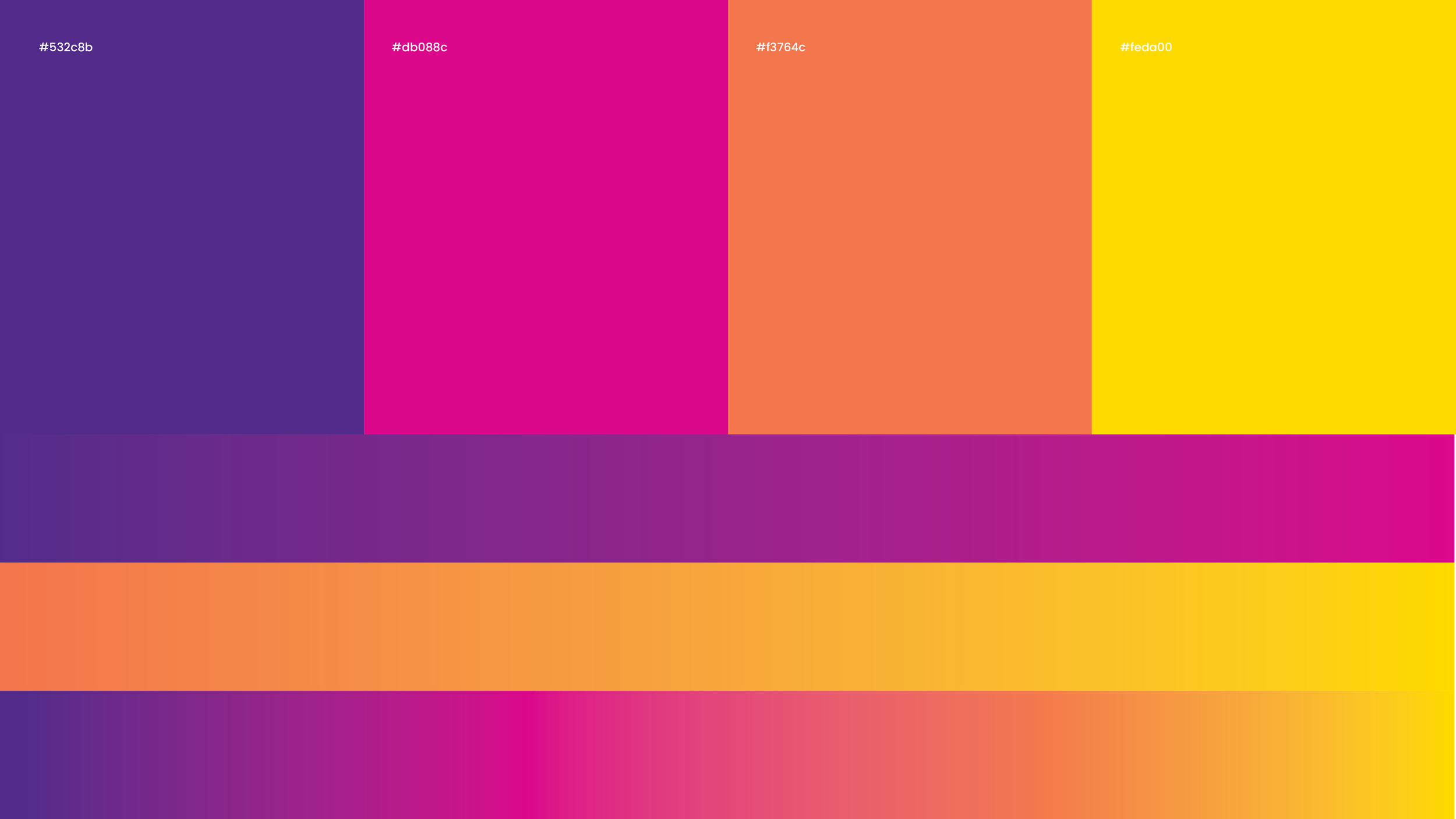
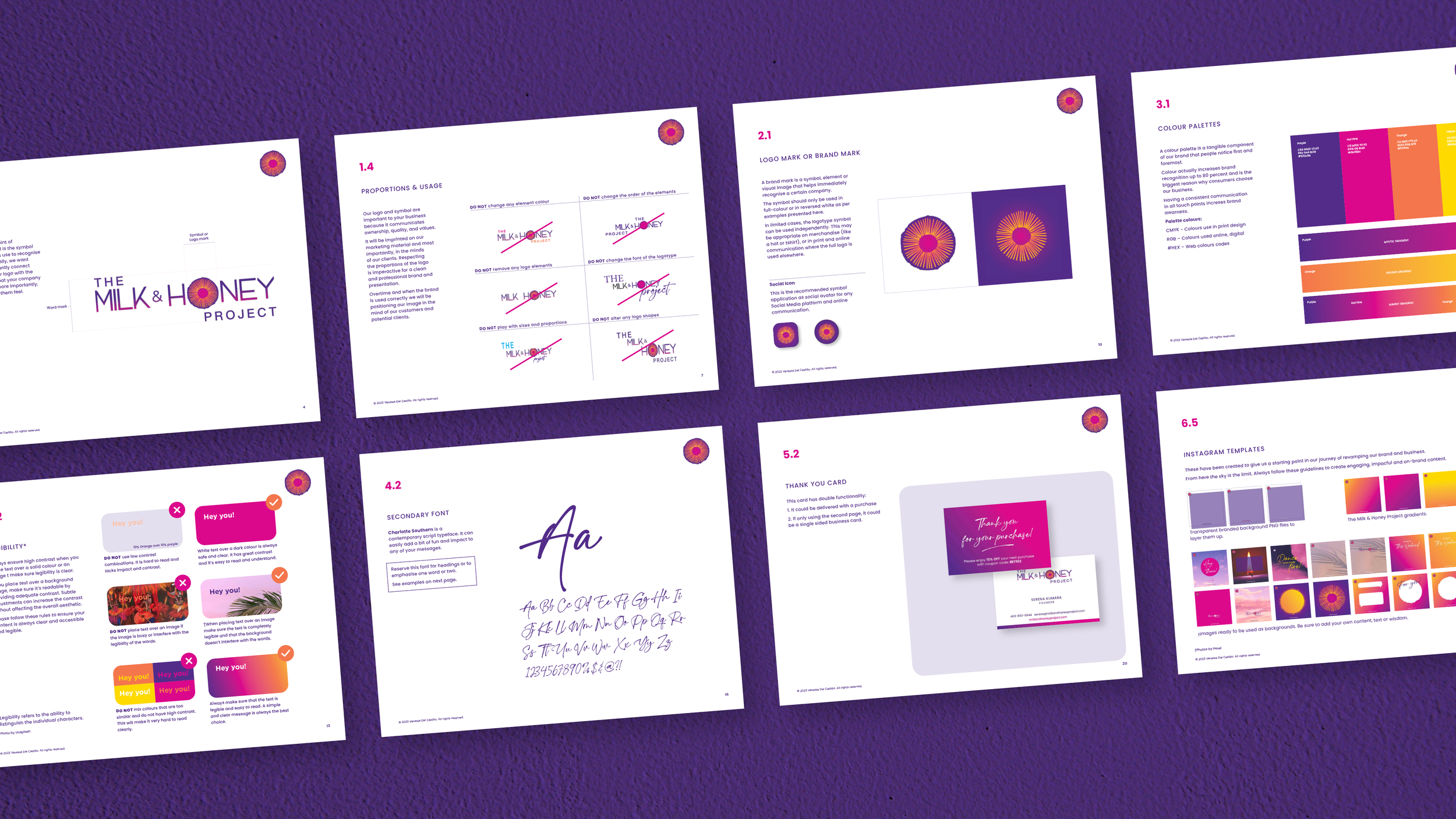
Introducing deep purple was pivotal, symbolising both healing and royalty. Our main inspiration was the vibrant colors of a sunset. We included warmth into the color palette, drawing from the richness of jewel tones like rich oranges, emerald and purples, and pink.
The outcome is a brand that emanates approachability and strength, blending opulence with an inviting, relaxed vibe.
Scroll down to listen to what the client had to say.
The Solution
ART DIRECTIONLOGO DESIGNBRAND DEVELOPMENTBRAND STYLE GUIDEINSTAGRAM CONCEPT DEVELOPMENTCLIENT KIND WORDS

Are you ready to transform your business?

